


Well, it’s about time: After nearly 2½ with the same basic look, Slicing Up Eyeballs was due for a makeover. So today we debut Version 2.0 of the website — or, rather, the beginning of Version 2.0, since the redesign is still very much a work in progress.
What it means, at the basic level, is we’ve changed WordPress themes from a very traditional and simple blog format — just a chronological stream of posts running down the page and not much else — to a more magazine-like layout, in this case, WPZOOM’s Manifesto theme.
Why? Primarily to able to showcase a wider variety of the site’s content by not just presenting a front page that features nothing but, say, the most recent 10 posts. Plus, to be perfectly honest, we needed a design that incorporated advertising a bit more smoothly.
Some of the new features include:
- Slider with featured posts: The top of the page now includes a slider that displays five hand-picked posts, which allows us to showcase certain “big” stories, plus contests, mixtapes or anything else that previously would have been lost in the shuffle.
- Mid-page featured tabs: Beneath the slider is a strip of featured tabs that allows us to spotlight the recent entries from certain categories of posts, including some of our most popular, such as the weekly Record Rack new-releases feature, our contests and giveaways, and the archival Vintage Video and Milestones features.
- Modified blog layout: The new design also keeps the traditional, chronological blog format, although in a modified fashion. Beneath the slider and the featured tabs, you’ll still find the most recent posts listed in straight chronological order. The only difference is, in keeping a tighter page, we’ve opted for abstracts and thumbnails rather than (mostly) full posts.
- Better sharing tools: At the top right sidebar on each post is a new tool with buttons to quickly share stories on a number of social-networking and bookmarking sites, including Facebook, Twitter, StumbleUpon and Digg. We’re also still playing around with in-story buttons for Twitter and Facebook, and soon will include Google+.
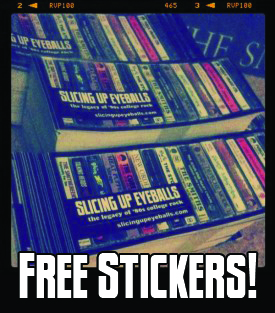
- More compact header: While the cassette-themed header has been wildly popular and the subject of many a wonderful e-mail from readers, it also was rather large and, particularly when a banner ad was placed above it, shoved the content very far down the screen, particularly for readers using small-screened computers and netbooks. By reformatting the header, we’ve kept the original image, but managed to take up less vital real estate with it.
So that’s the basic rundown. As mentioned earlier, this is still a work in progress, and will continue to be tweaked in the days and weeks to come. In the meantime, we’d really love to know what you think about the new look and, in particular, the functionality. There are bound to be bugs and glitches, so please let us know. Post your thoughts, critiques, tips, etc., in the comments below.
And, as always, thanks for reading.


Looks great!
kudos. looks terrific!
I love it, good job!
I wish I had the skills to do the same to my website.
Thanks for the compliments, although, Dave, not a whole lot of skill on my part — I changed WordPress themes and did some minor tweaking/customization…
Nice new look. – Congrats!
Looks good, but the slider thingy makes me dizzy :P
Great site btw.
To much space wasted on that right frame- the feed and sharing icons + email would be better stashed away at the bottom somewhere since they’re not going to be used often (i.e. you’ll only put your email in the notification field once, so why do you need it clogging up your reading room since you’ll never need to use it again?)
Also don’t need the Recommendations on the right side since i read this page daily- you can check your web logs and see how many people actually click on it- if a lot do then by all means, keep it in. But if it’s not a lot, ditch it.
I much rather have as much reading room as possible than things that cramp that. :)
This page, a candy blog, had a full page site but then they redesigned it and threw in not one but *two* frames containing nothing but sections that nobody found useful- and in the process squeezed the main info into a teeeeeny box in the middle. No amount of reasoning worked on the web admin, so gave up and haven’t visited that place in 2 years… until just now. If you want to see someone ruin a perfectly fine site, now’s your chance. http://www.candyblog.net/ (Btw, i used to design and code lots of websites, just just my 2 cents :)
blog looks great! was a bit thrown by the slider at first because it just kept looping but soon realized that when i click the article i wanted to read to the right of it the slider stopped looping and stays put giving me the time to check it out. that’s a nice option. modern look is pretty nice. great jorb!
I like it.!! thanks :)
That slider needs to go. Too distracting and too fast to actually read the info before it ‘moves on’. I agree with the wasted space comment as well.
Thanks for the input, guys. I appreciate it. I’ve slowed the slider down a bit to give more time to read. And as for the right sidebar, I still haven’t fully developed that — just threw a few things up there for launch. Hope to tweak it today, but I appreciate the suggestions all around…
Sorry, don’t like the change. The old format worked fine. Maybe call me old fashioned but hey I am looking for info on 80s music. Maybe for the next verion of this site you can start to include info on Lady Gaga.
is there anyway to do a theme type thing where you can click “go to previous site” and it goes poof! to the old look?
Nicely done…looks stellar!
It’s a bit too busy for me. I have a hard time locating exactly where the new content is.
Like it! Change is good. Only wish you didn’t have to go back when you expand a story. You should be able to continue reading all the treads after you click continue reading – like pitchfork does it. my 2 cents.
An awesome site has gotten even better!!! Looks great!!!
This is a great site however I am not digging the new layout. It is too cluttered and I miss the picture of the tapes being more prominent at the top. It also reminds me of the nme site which really tries to look like a newspaper but falls flat because of the laptop form factor of a monitor. There is not enough space on most people’s laptop monitors to properly show this layout. Only my opinion and I still dig the site.
The thing I don’t like about the redesign is that the news stories don’t seem to be the feature of the site anymore as one has to scroll down to see them, hidden at the bottom.